Manchester, 1982.
Someone has an idea.
Let’s open a nightclub.
Fair enough.
Then someone else apparently decides the nightclub needs a catalogue number.
FAC 51.

Because this wasn’t just a nightclub.
This was Factory.
And Factory had a habit of treating practically everything it touched as part of one enormous piece of art.
Records got catalogue numbers.
Posters got catalogue numbers.
Stationery got catalogue numbers.
Christmas presents got catalogue numbers.
And eventually an old industrial building on Whitworth Street West got one too.
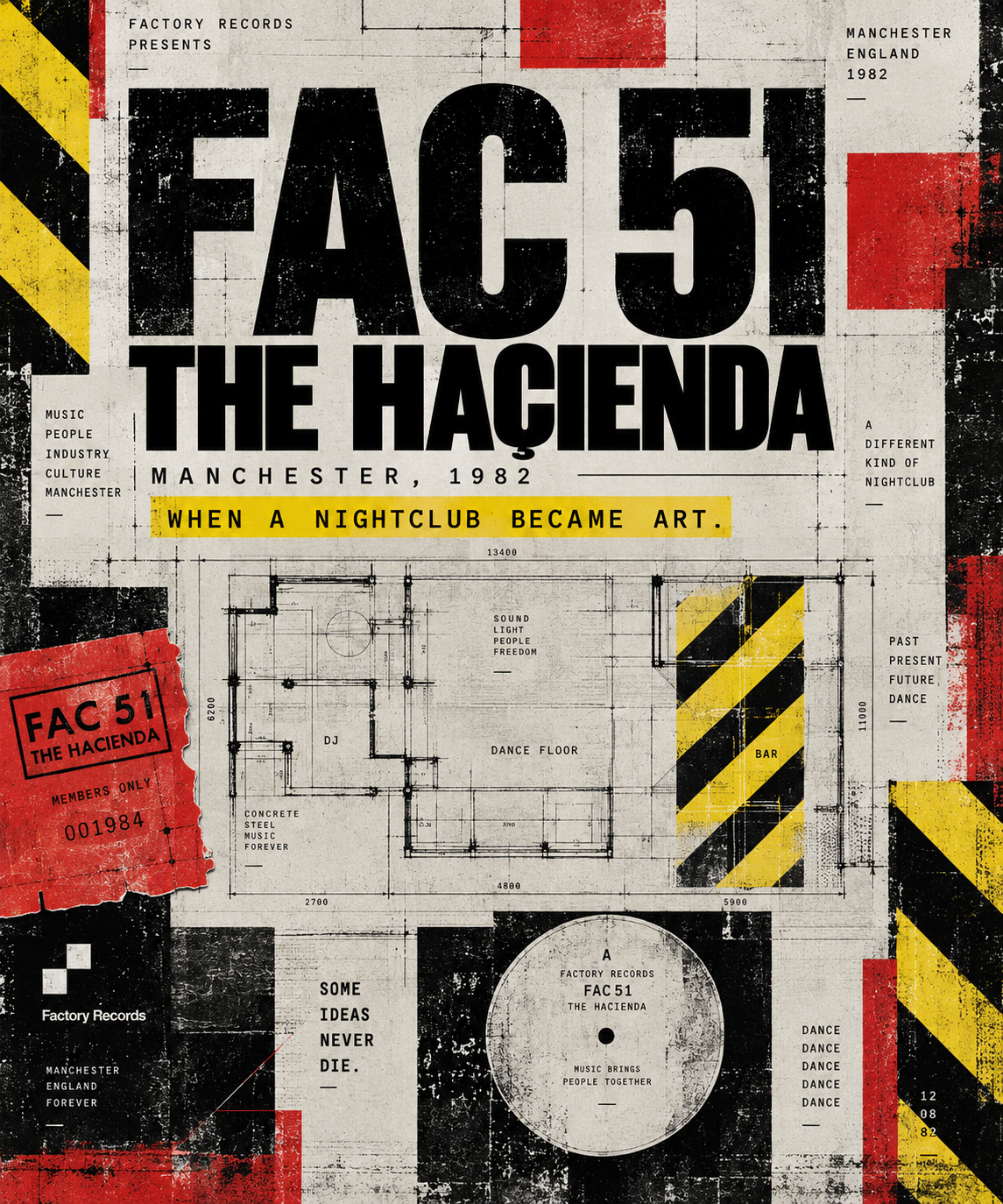
FAC 51. The Haçienda.
Completely unnecessary.
Absolutely brilliant.
IT DIDN’T LOOK LIKE A NIGHTCLUB.
That was rather the point.
The Haçienda was designed by Ben Kelly, with graphic design associated with Peter Saville, inside a former industrial space.
Concrete.
Steel.
Scaffolding.
Industrial lighting.
Hazard stripes.
Bollards.
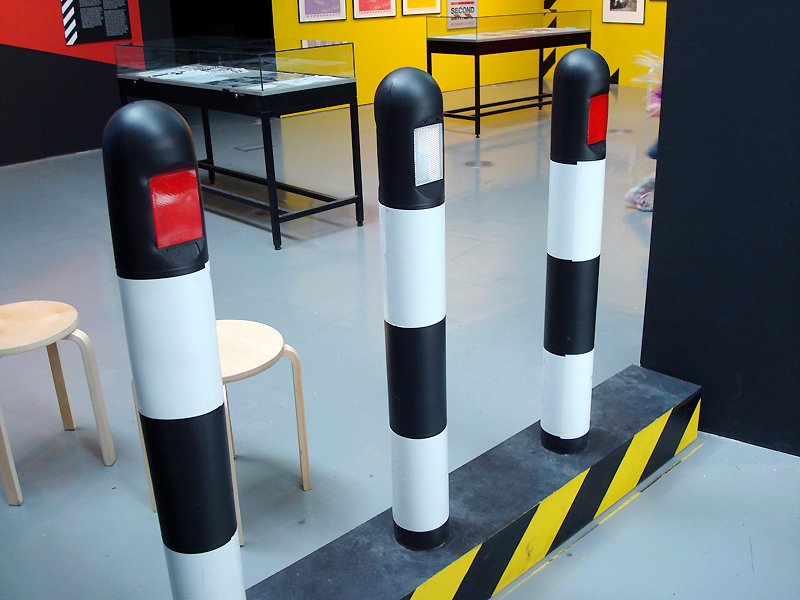
Things that looked like they belonged next to a loading bay rather than a dance floor.
The V&A would later describe the club as a physical manifestation of Factory’s philosophy.
Think about that for a minute.
They didn’t decorate a nightclub.
They designed an environment.
The building became part of the artwork.
The signs mattered.
The membership cards mattered.
The menus mattered.
The typography mattered.
The colours mattered.
Even the bloody hazard stripes mattered. The Science and Industry Museum’s Factory archive still holds examples of Haçienda menus, membership material and other pieces carrying that visual language.
Nothing was just there.
It all belonged to something bigger.
THAT’S VERY MANCHESTER.
There’s something wonderfully northern about taking an old industrial building and deciding:
Yeah. This’ll do.
Not knocking it down.
Not pretending it isn’t industrial.
Not covering everything in marble and sticking a rope outside.
Use the concrete.
Use the steel.
Use the bloody building.
Manchester spent generations making things.
Cotton.
Machines.
Locomotives.
Chemicals.
Computers.
Then, somewhere along the way, we started making culture out of the remains.
Warehouses became clubs.
Industrial graphics became record sleeves.
Machines became inspiration.
Grey became a colour palette.
And rain became a personality trait.
THEN THERE WAS FACTORY.
Factory Records understood something that plenty of companies still don’t understand now.
The product isn’t the whole product.
A record wasn’t just music.
It was the sleeve.
The typography.
The photography.
The catalogue number.
The poster advertising it.
The shop where you found it.
The club where you heard it.
The people standing next to you when it played.
Peter Saville’s typographic approach became fundamental to Factory’s visual identity from its earliest releases, while Factory’s catalogue eventually encompassed objects and experiences far beyond records.
That’s why Factory still looks modern.
Not because they somehow predicted 2026.
Because they understood identity.
FAC 51.
There’s something we particularly love about those five characters.
FAC 51.
Cold.
Industrial.
Almost bureaucratic.
Sounds like something stamped onto a crate in a warehouse.
Yet those characters came to represent one of the most famous nightclubs Britain ever produced.
That’s design doing what design is supposed to do.
Taking something simple and loading it with meaning.
Once you know, you know.
No explanation required.
AND THEN THE PEOPLE ARRIVED.
Of course, a building isn’t a culture.
People are.
The Haçienda changed as Manchester changed.
Post-punk.
New Order.
Electronic music.
House.
Acid house.
Madchester.
A city finding a completely different rhythm.
The interesting thing is that the design was already waiting for it.
The industrial surroundings suddenly made perfect sense.
Machines making music.
People dancing inside a former warehouse.
Manchester’s past and future occupying the same room.
You couldn’t design a better metaphor if you tried.
BAD BUSINESS. GREAT IDEA.
There’s another reason we love Factory.
It wasn’t perfect.
Far from it.
Sometimes the decisions seem completely ridiculous when viewed through the sensible eyes of business.
But culture isn’t always created by sensible decisions.
Sometimes somebody has to say:
Fuck it. Build it.
Factory’s partners chose to put money into creating the Haçienda rather than pursue another proposed investment in studio technology. The club became FAC 51 and opened the next chapter of the Factory story.
Would an accountant have done it?
Probably not.
Thank God.
DESIGN DOESN’T HAVE TO STAY ON PAPER.
That’s the bit that matters to us.
Art doesn’t have to live in galleries.
Design doesn’t have to live on posters.
It can be a record sleeve.
A nightclub.
A membership card.
A car.
A chair.
A building.
A technical drawing.
A number printed in exactly the right typeface.
Anything can become significant when somebody gives enough of a shit about how it looks, feels and exists in the world.
That’s what Factory understood.
That’s what the Haçienda proved.
And that’s a big part of what inspires OriginalAgain.
Take the ordinary.
Look at it differently.
Don’t ask whether you’re supposed to do it.
Do it anyway.
Some people won’t understand.
Fine.
Manchester’s never been particularly bothered about that.
FAC 51.
Not just a nightclub.
A bloody great piece of art.
WANT THE OTHER SIDE OF THE STORY?
The Haçienda wasn’t only an extraordinary piece of design.
It was also, financially speaking, a bit of a fucking disaster.
OriginalAgain founder Mick Armstrong has written about Tony Wilson, Factory Records, going to the Haçienda in the late 1980s and why sometimes the worst business decisions create the things we’re still talking about decades later.
TONY WILSON WAS A SHIT BUSINESSMAN.
Thank God nobody stopped him.
Read Uncommon Thought #002 →
Read TONY WILSON WAS A SHIT BUSINESSMAN on MickArmstrong.com
OriginalAgain
Artwork With Attitude.
Manchester, England.